Domino’s is getting a makeover—its first in 13 years—and yes, it’s serious about making you crave more than just the toppings. The iconic red and blue are getting louder, the font is getting doughy, and even the boxes are stepping up their game. With a catchy jingle from Shaboozey and black-and-gold packaging for premium pies, this isn’t just a tweak—it’s a statement. Let’s dive into the new look, the thinking behind it, and what it all means for your next slice.
Bold New Colors, Fired Up

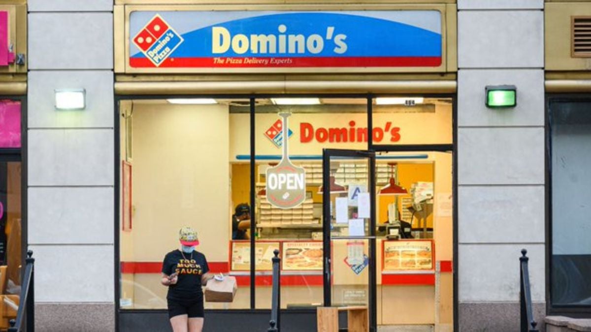
Domino’s fresh palette amplifies its signature red and blue into brighter, more eye-catching versions. This isn’t a subtle tweak—the brand is turning up the visual volume to stand out in a cluttered food world. By making the colors pop harder, it aims to capture attention whether you’re scrolling on your phone or spotting the box at your doorstep. It’s brand recognition, dialled up.
A Font That Looks Like Pizza

Meet the new typeface: “Domino’s Sans”. It’s thicker, rounder, with “doughy” curves designed to echo pizza itself. The brand isn’t just changing its dress—it wants the letters to feel like food. Rolling this out across packaging, digital screens and store graphics helps reinforce that crave appeal at every touchpoint.
Box Game Strong: Premium Gets a Luxe Upgrade

Premium pizzas like the Handmade Pan and Parmesan Stuffed Crust will arrive in snazzy black-and-gold boxes instead of standard cardboard. This is all about elevating the treat-you-moment: when you order something special, the unboxing signals it. The standard pies aren’t left out, either—with brighter boxes and more visible logos.
Jingle Time: “Dommmino’s” for the Win

The brand has launched a new jingle featuring Shaboozey—and yes, it stretches Domino’s to “Dommmino’s” so you literally hear the “mmm” in the name. It’s a playful audio hook meant to tap into the satisfaction of that first bite. Plus, it sets the tone: this brand refresh is as much about sound and feeling as sight.
Everywhere You Look: Brand Signals Upgraded

This refresh isn’t just about the box or logo—it spans uniforms, digital menu boards, app UI, window graphics and more. Stores are getting new team member gear, online platforms are getting updated visuals, and the overall vibe is being unified. It shows the brand wants to feel modern, consistent and relevant across every touchpoint.
Why Now? Growth Mode, Not Crisis Mode

Interestingly, the brand isn’t redoing everything because it’s failing—it’s doing this from a place of strength. With solid sales and global expansion, the chain is betting on staying relevant rather than catching up. As CMO Kate Trumbull put it: “there is risk in doing nothing.”
From Tech-Focus to Pizza-Focus

In prior years, much of Domino’s marketing leaned heavily on its tech edge—apps, delivery innovations, trackers. With this refresh, the emphasis shifts back to the product and experience. The packaging, visuals and audio are all aimed at highlighting the pizza itself—not just the ordering system.
Global Roll-out in Motion

The update is slated to roll out in the U.S. and a number of international markets over the coming weeks and months. No single store redesign yet, but the visual changes will ripple through packaging, uniforms and digital platforms. So your next pizza order might arrive in a box you barely recognise (in a good way).
Learning From Others: Avoiding Brand-Refresh Blunders
Domino’s points to the pitfalls of rebrands gone wrong (hello, public backlash) and is taking a more cautious path. By modernising rather than overhauling, the brand aims to keep its iconic identity while injecting freshness. The strategic partnership with design agency WorkInProgress helped steer the change.
What It All Means for You — the Customer

For the pizza-lover, the refresh means the same recipes you love wrapped in a more stylish package. It means a more consistent brand experience whether you’re ordering via app, visiting in-store, or tearing into a box at home. And if you peek at that black-and-gold box? You’ll know you’re in premium pizza territory.
The Big Question: Will It Work?

Packaging and visual identity matter more now than ever, especially with social media unboxing and food photography dominating feeds. Early reactions have been positive — fans on social platforms are already saying “I’ll order just for the new box.” Time will tell whether this spark translates into long-term growth, but the groundwork looks solid.
Takeaway: Familiar Brand, Fresh Bite

Domino’s isn’t reinventing the pizza wheel—it’s polishing it. By refreshing colors, packaging, audio identity and typeface, it reinforces what people love while embedding a bit of today’s flair. For fans of the brand, it’s a visual and experiential upgrade; for new customers, it might just make the pizza moment feel a little more special.

