Cracker Barrel has found itself at the center of one of the year’s most unexpected branding controversies. What started as a simple logo refresh quickly spiraled into accusations, backlash, and a rare corporate reversal. Many assumed the rebrand was driven by politics, but the real motivation turned out to be far more practical. Even the company’s CEO stepped forward to clear the air, revealing the surprising logic that powered the redesign. Here’s the full story behind the rebrand that shook up highway diners everywhere.
A Logo Change That Sparked Instant Outrage
Cracker Barrel’s rebrand debuted to swift and intense criticism. The refreshed logo removed the longtime illustration of “Uncle Herschel,” a figure affectionately known to customers as the “Old Timer.” Within hours, social media erupted with accusations of the chain becoming “too woke.” The backlash grew rapidly, overshadowing the company’s actual intentions. What was meant to be a modern update instead became one of the internet’s hottest debates.
Fans Mourned the Loss of a Familiar Icon
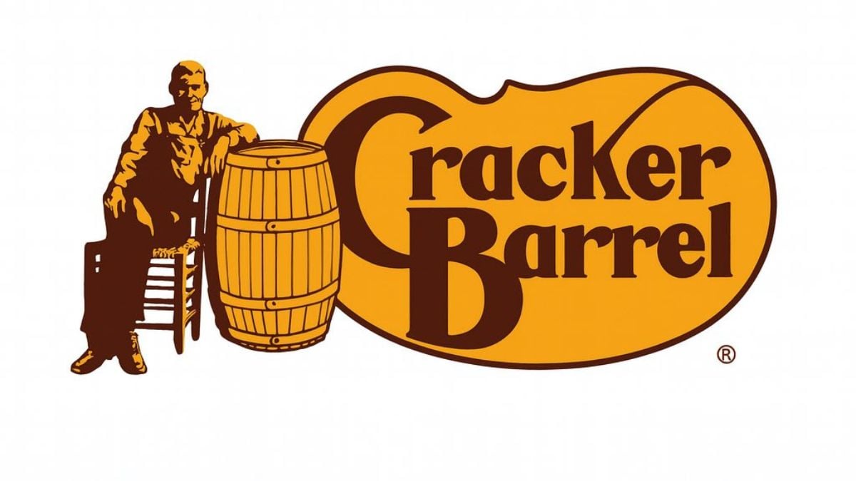
The biggest flashpoint stemmed from removing the well-known character who had defined Cracker Barrel’s visual identity for decades. Many longtime customers felt the new minimalist design stripped away the brand’s nostalgic charm. The old wooden-front aesthetic, rooted in Americana and comfort, suddenly looked unfamiliar. For a brand built on tradition, change hit harder than expected. The shift ignited passionate reactions about heritage, identity, and what customers felt the brand represented.
A Side-by-Side Look Fueled the Backlash
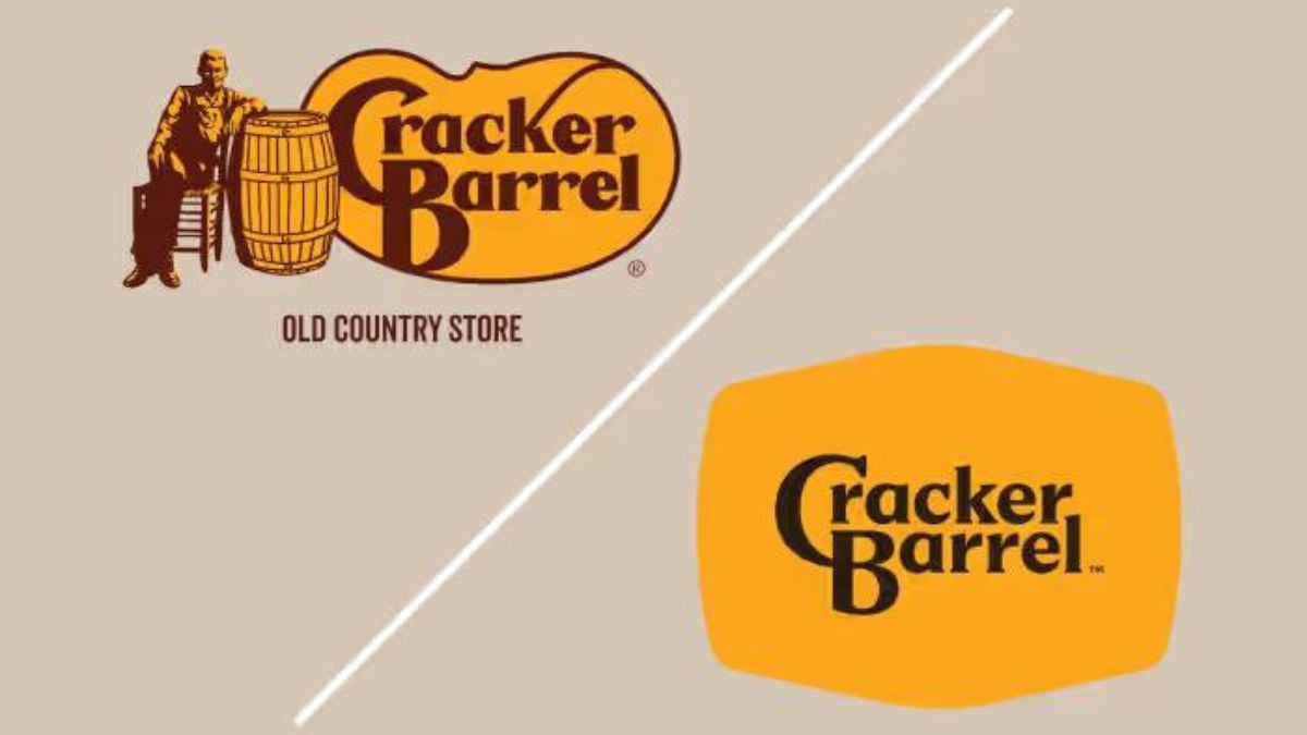
Once image comparisons began circulating, the criticism intensified. The contrast between the classic logo—complete with the man, the rocker, and the barrel—and the pared-down updated version was stark. Online users argued that the new look lacked personality, warmth, and connection to the chain’s roots. The minimalist design trend didn’t win over many of Cracker Barrel’s fans. Instead, it became visual proof—at least to critics—that the brand was “changing too much.”
The Internet Turned It Into a Culture War
Almost immediately, the rebrand became meme fodder and political battleground territory. Commenters claimed the redesign was another example of companies bending to online pressure or modern trends. Although none of these claims aligned with the company’s actual strategy, the narrative spread quickly. The more the accusations circulated, the more heated the debate became. In the echo chamber of social media, outrage drowned out the facts.
The CEO Finally Set the Record Straight

Amid the uproar, Cracker Barrel CEO Julie Felss Masino stepped in to explain what really motivated the rebrand. Speaking at an investor conference, she revealed that the redesign had nothing to do with politics or image shifts. Instead, it was tied to long-term strategy and operations. Her clarification immediately reframed the conversation. What many assumed was ideological turned out to be highly functional.
Visibility, Not “Wokery,” Drove the Design
According to Masino, the new logo existed for one simple reason: highway visibility. The company wanted a design that was easier to read from long distances and on billboards. It wasn’t about removing heritage—it was about helping drivers recognize their next stop while traveling. The entire redesign was rooted in readability and practicality rather than cultural positioning. Ironically, the intent was to make the brand more noticeable, not less recognizable.
Highway Billboards Needed a Clearer Look

Cracker Barrel’s roadside presence is a major part of its identity, making signage clarity essential. With long stretches of interstate travel, drivers often make snap decisions based on what they can see clearly. The updated logo was created to enhance that quick recognition. Using simpler shapes and cleaner typography, the redesign aimed to improve visibility at high speeds. This functional purpose ended up buried under the online noise.
A Strategic Move for Long-Term Success
Masino emphasized that the rebrand was part of a bigger transformation plan for the company. The goal was to modernize just enough to stay competitive while still keeping its core identity intact. Enhanced signage was only one piece of the broader effort. She noted that the chain is preparing for growth and evolving customer needs. Unfortunately, that nuance didn’t stand a chance against social media outrage.
The Backlash Became Too Loud to Ignore

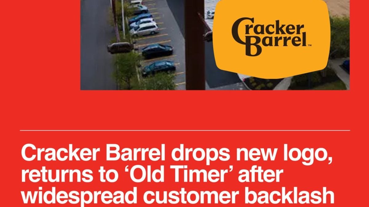
While the company defended its intentions, the criticism didn’t die down. The uproar grew so intense that Cracker Barrel eventually decided to shelve the new logo altogether. The public pressure mounted faster than the brand could respond, leaving little room to test the logo’s real-world impact. In the end, the company reversed course to quiet the uproar. The decision marked one of the year’s quickest brand retreats.
The Logo Won’t Be Making a Comeback
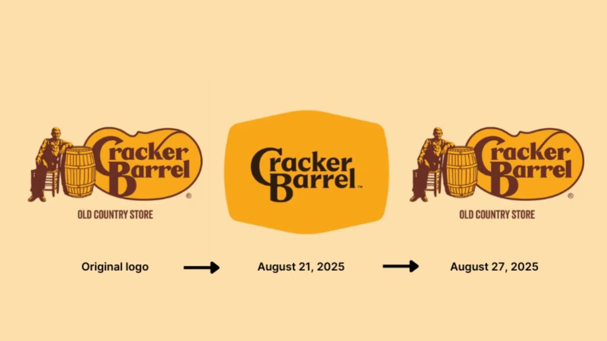
Despite its practical purpose, the updated logo won’t appear on future billboards, menus, or signage. The company pulled it completely, returning to the familiar version loyal customers recognized. It’s a rare example of a major brand abandoning a rebrand before it even properly launched. For many observers, it’s a reminder of how fast online backlash can shape corporate decisions. The logo’s brief existence is now a case study in branding misfires.
The Story Shows How Tricky Rebranding Can Be
Cracker Barrel’s short-lived redesign highlights the challenge of modern rebranding. Balancing heritage with visibility, clarity, and modern design trends is a tough task—especially when nostalgia plays such a big role. Even well-intentioned updates can trigger unexpected emotional reactions. And when a brand holds decades of meaning for customers, small visual changes can spark outsized responses. Cracker Barrel learned firsthand how tough that tightrope can be.

