Cracker Barrel Old Country Store tried to refresh itself — but instead sparked a full-blown backlash. The chain unveiled a new logo and modern store look, only to reverse course within weeks. Foot traffic and stock took a hit, and even political voices weighed in. This is the story of how a logo became a lightning rod — and what brands can learn before their next identity overhaul.
Heritage Meets Disruption
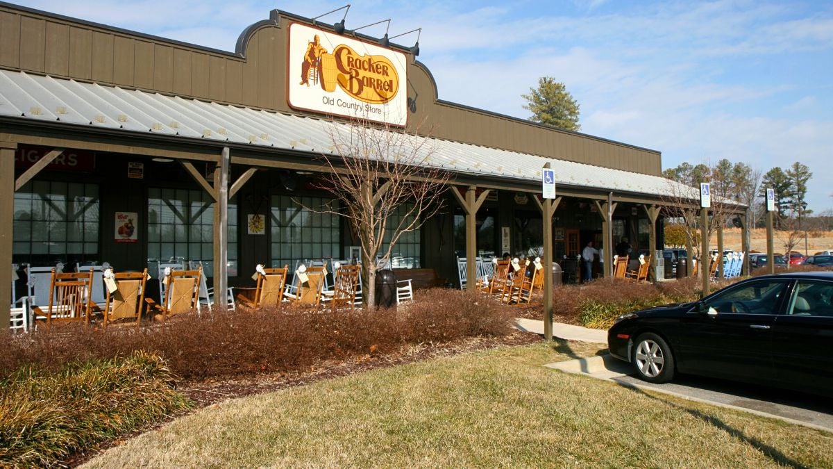
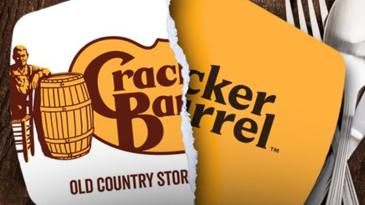
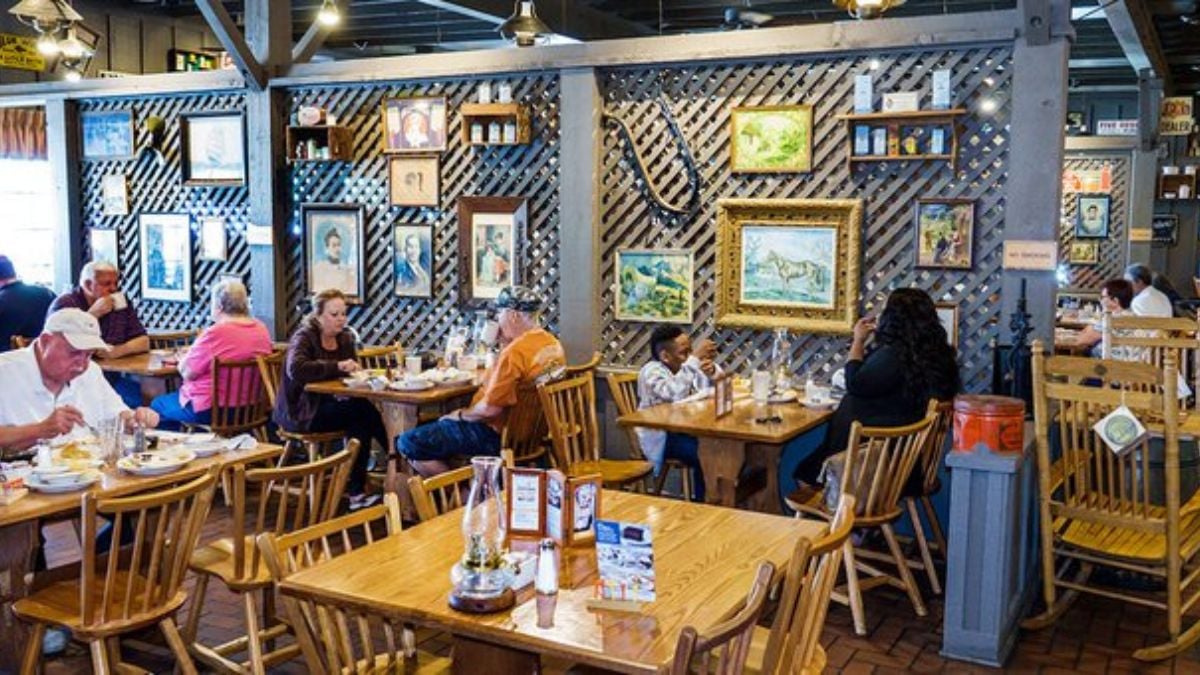
Cracker Barrel has long been known for its rustic, Americana-style branding — think rocking chairs on the porch, country store feel, and the old-timer figure leaning on a barrel. In 2025, the chain decided to modernize. They rolled out a “fifth evolution” of the logo and planned store redesigns. But heritage brands seldom shift without risk — as Cracker Barrel soon discovered.
Logo Redesign Sparks Outcry
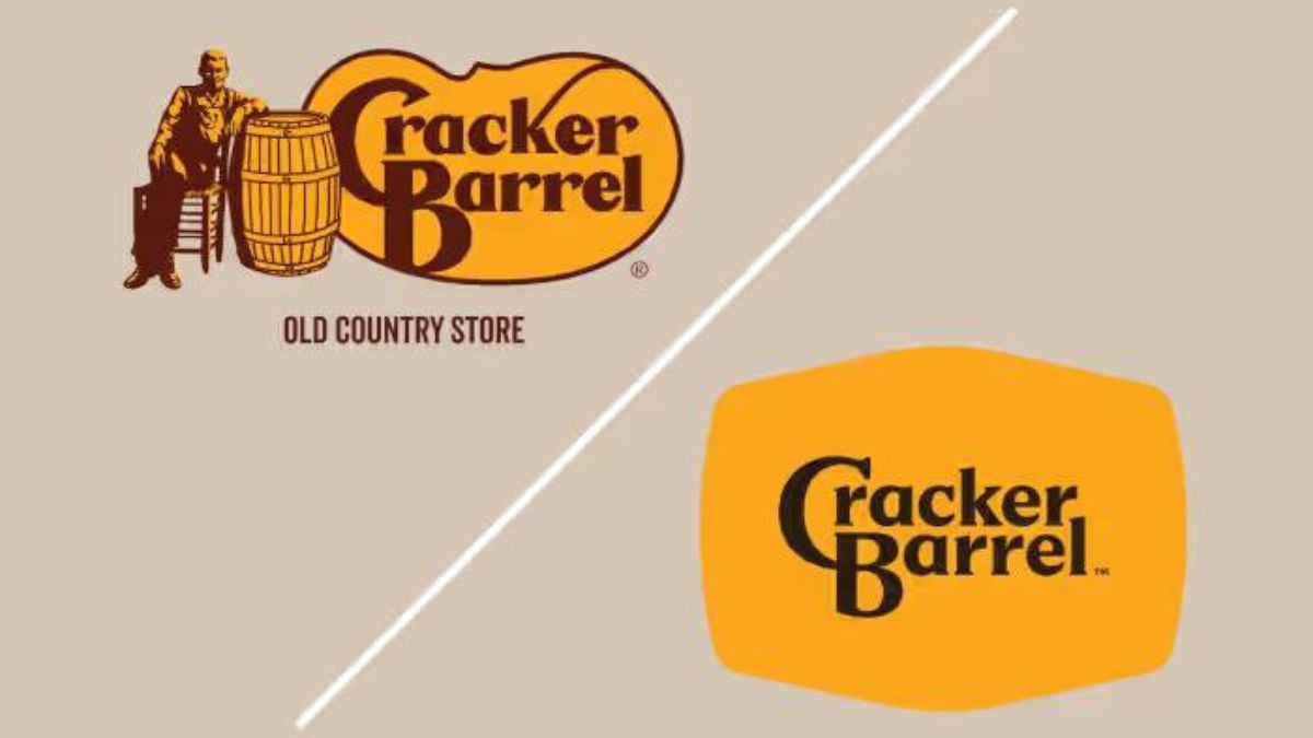
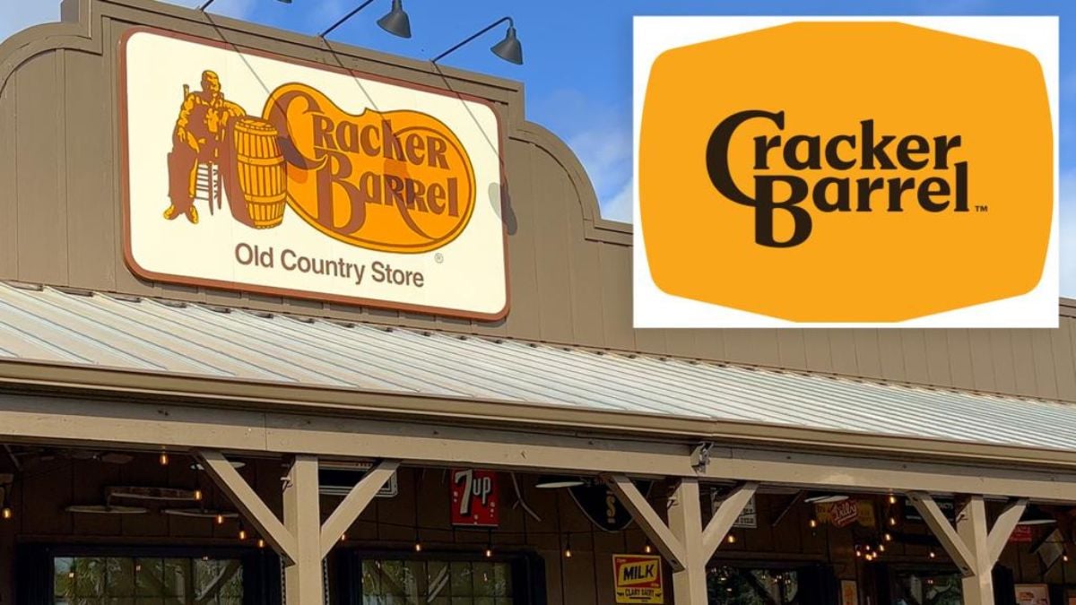
When the new logo debuted in August 2025, it dropped the beloved “Uncle Herschel” figure — a man in overalls leaning on a barrel — in favor of a simplified type mark. Some fans called it bland; others labeled it a “woke” pivot. The reaction was swift and vocal.
Traffic Tumbled After the Reveal
According to foot-traffic data, Cracker Barrel’s visits dropped significantly after the logo change started rolling out. In the week of August 25, traffic slid by 5.3 % year-over-year — nearly double prior weekly declines. Shortly after, declines deepened into the double digits in some weeks. The rebrand clearly shook customer behavior.
Stock and Market Panic
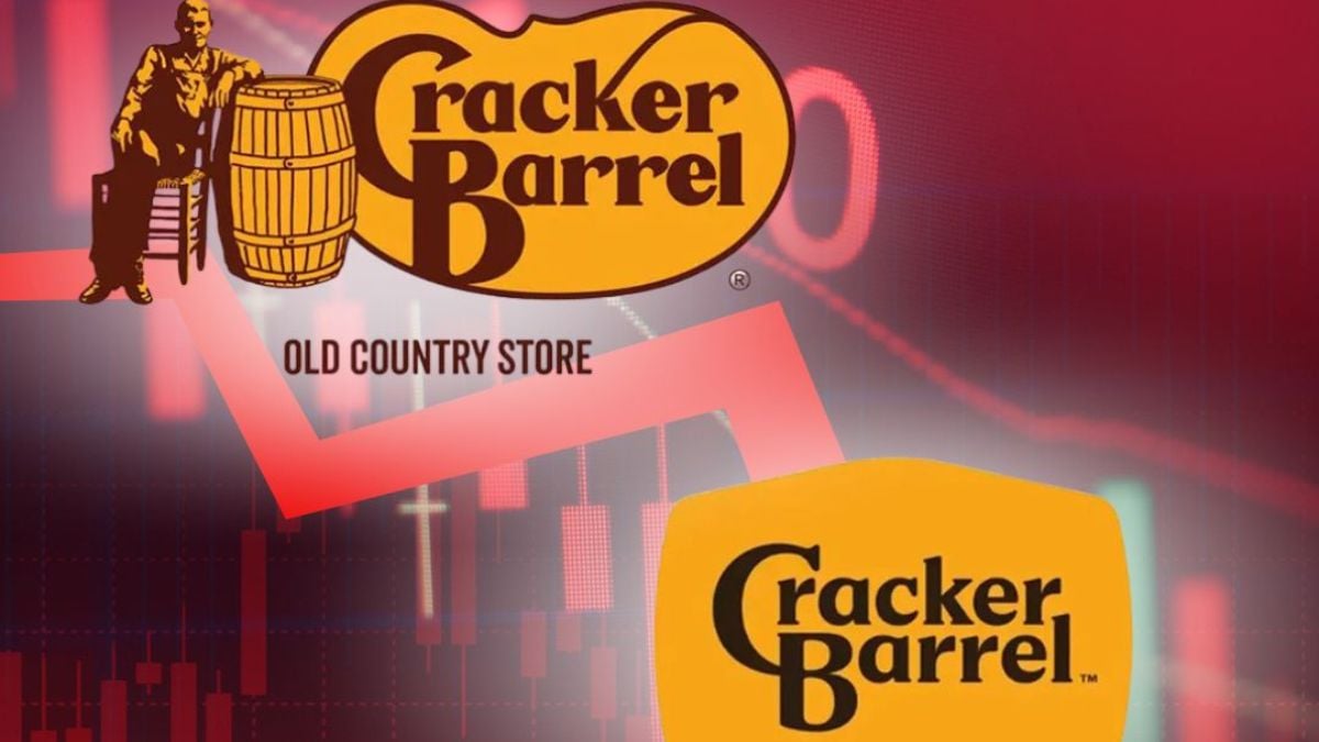
Not only did customers flinch — investors did too. Shares plunged and the company reportedly lost almost $100 million in market value the day after the redesign announcement. The logic: When brand equity wobbles, the market listens. Cracker Barrel found out the hard way.
Culture War Hits Branding
What could’ve been purely a design misstep got wrapped up in politics. The redesign stirred accusations of “going woke” from right-leaning critics — including public figures and conservative commentators. Branding isn’t just aesthetics anymore; it can become a cultural flashpoint.
Cracker Barrel Reverses Course
Under intense pressure, Cracker Barrel back-pedaled. By late August they announced they’d revert to the old “Old Timer” logo and suspend further widespread use of the new one. It was a rare public U-turn triggered by branding backlash.
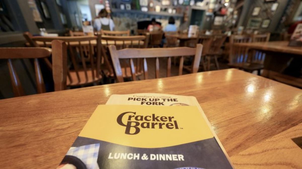
Remodels Called Off Too
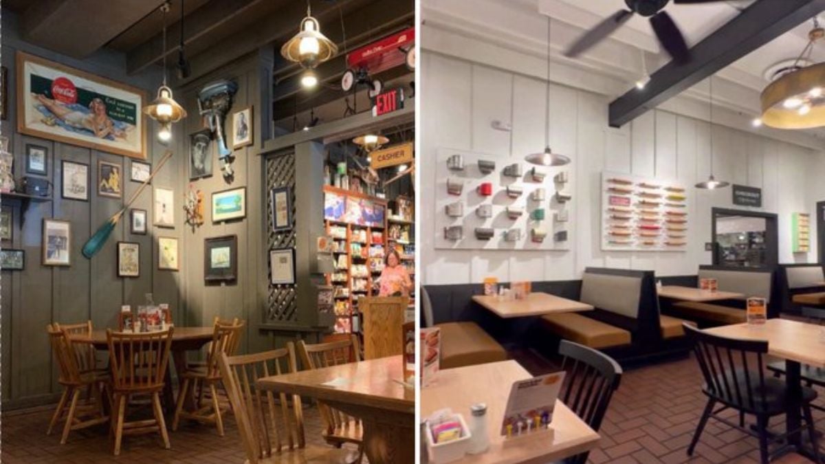
The chain didn’t stop at logos. Their ambitious store-remodel program — meant to modernize hundreds of locations — was paused. The company heard from customers: “We like the rocking chairs, the fireplace, the peg games.” The message: Don’t mess with the parts people love.
Management Shake-up Amid the Mess

Amid the fallout, Cracker Barrel ended its relationship with its creative agency, changed elements of its leadership, and faced pressure from activist investor Sardar Biglari. Biglari has been opposing the company’s direction for years. The rebrand brouhaha became another front in that longer battle.
Branding Lessons From the Fallout
Experts say the mistake was rooted in forgetting what made Cracker Barrel resonate: its story. The old logo told a tale of old-country warmth and comfort. The new one read as generic, stripped of personality. For brands, this is a caution: modernization is risky if it abandons core identity.
Recovery Road: What’s Next for Cracker Barrel
Cracker Barrel expects traffic for Q1 2026 to be down about 7 %-8 % year-over-year. They’re banking on menu innovation (like bringing back the “Campfire meals”), training, and other guest-experience tweaks to regain momentum. The key now is rebuilding trust, not just refreshing visuals.
Beyond the Logo: Menu and Quality Moves
Amid the drama, the chain hasn’t ignored core operations. They’re investing in kitchen upgrades, reducing food waste and re-introducing value meals. These actions might matter more than any logo — because at the end of the day, diners come for comfort food, not corporate packaging.
What This Means for You as a Customer
If you loved Cracker Barrel for its nostalgic feel — rocking chairs, country store, warm vibes — the lesson is clear: You’re not crazy for caring about details. Brands live and die by trust and consistency. When something feels off, notice it. And when a brand tries to change fast, it may ask too much from its audience.

