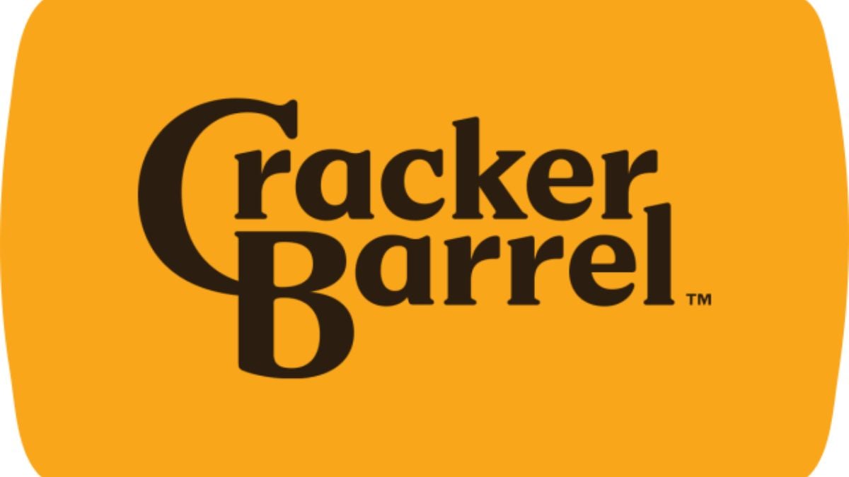
Most restaurants tweak logos all the time. But when Cracker Barrel unveiled a new one in August 2025—dropping its beloved “Old Timer” figure and the “Old Country Store” wording—it touched a nerve. Loyal customers felt the change was erasing a piece of identity. Stock dipped. Traffic fell. Days later, the company reversed course. The logo swap isn’t just a branding flub—it’s a cautionary tale about what really matters when a brand means comfort, history, and home.
When The “Old Timer” Left the Logo
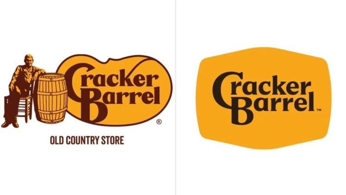
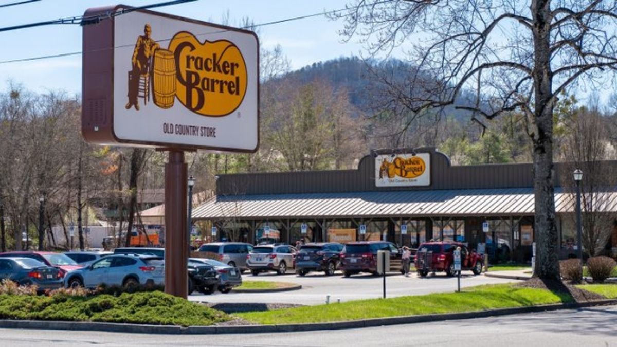
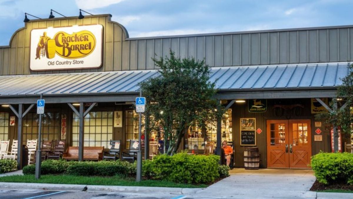
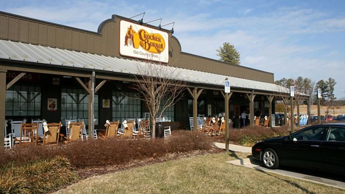
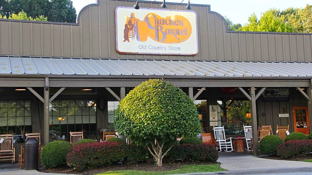
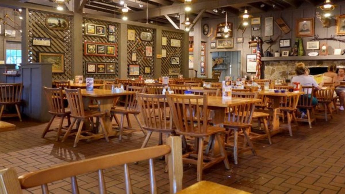
For nearly 48 years, Cracker Barrel’s branding featured “Uncle Herschel” (also called Old Timer), the man leaning on a barrel. That image became the face of its nostalgia, roadside Americana, and Southern comfort. Then, in mid-August, the chain introduced a text-only design that removed that figure entirely and simplified its name. For many customers, this wasn’t modernization—it felt like losing part of the story.
Why the Move Sparked Immediate Backlash

Almost as soon as the change was announced, fans (and former fans) erupted online. Critics said Cracker Barrel was abandoning its roots and going “generic.” Conservative voices accused the chain of being “woke.” Influencers and celebrities joined in. Even former President Trump chimed in, calling for a return of the old logo. The backlash was bipartisan but especially loud among people who felt a strong emotional attachment to the classic image.
The Financial Shockwave Hits

It wasn’t just about feelings—numbers started hurting too. Foot traffic dropped about 8% after the logo change, on top of a 1% drop just before the announcement. Stock fell around 3%, then more significantly later when investors reacted. Cracker Barrel forecasted weaker revenue and traffic for the upcoming fiscal year.
Logo Reversal: “We Heard You” Move
Just days later, Cracker Barrel backtracked. They scrapped the new logo and said the “Old Timer” figure would stay. Also paused remodels at stores where the modern look had been applied.They issued statements like “We hear you,” acknowledging that the emotional bond with their identity was underestimated.
How Branding Folded Into Politics and Culture Wars
What makes this logo fiasco different from a typical design misstep is how quickly it became a proxy for political identity. MAGA voices framed it as another example of “woke” erosion of traditional America. Critics and media outlets picked up on how people viewed “Old Timer” as more than just a character—it stood for heritage, for rural identity, for simpler times.
Customer Voices: Nostalgia & Feeling of Loss
People shared stories of stopping at Cracker Barrel on road trips as kids, of Uncle Herschel being a roadside landmark. In towns like Pensacola and Naples, customers said the old logo reminded them of family, of the Old Country Store experience. Many said the change made the place feel less “authentic.” Some didn’t mind modernization; a few others felt “betrayed.”
How Cracker Barrel Misjudged Attachment
Cracker Barrel clearly assumed that a simpler logo would modernize the brand and maybe appeal more to younger or newer customers. But what they underestimated: how attached people are to the old visuals—not just because they look “old,” but because they carry meaning. “Knowing your brand’s story” isn’t marketing fluff—it’s something people live with. Emotional investment can outweigh design logic, especially in legacy brands.
Competitors Who’ve Messed with Logos—Lessons There Too
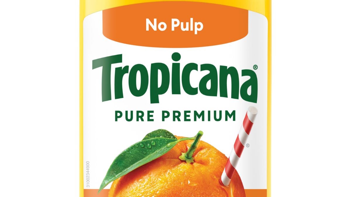
Other brands have done this wrong. Tropicana’s packaging redesign in 2009 confused customers and cost them millions. IHOP’s brief flip to “IHOb” caused ridicule and didn’t stick. These examples show that taking out iconic visual signals is risky, especially for brands tied to tradition. Cracker Barrel stood out because its identity was wrapped up in “Old Timer,” the porch, the barrel, and losing those was losing something fans cherished.
What Cracker Barrel Needs To Do Now
Restoring the logo is step one. Beyond that, the challenge is rebuilding trust. That means keeping consistent visuals, being transparent about future changes, running nostalgia-focused marketing, and (very importantly) not introducing more surprises. Cracker Barrel is leaning heavily into its loyalty program, its strong base of older diners, and avoiding hasty rebrands.
What This Reveals About How Branding Really Works
One logo doesn’t make a brand—but losing something symbolic can break the connection people feel. Branding isn’t just about looking good; it’s about belonging, identity, emotional continuity. For Cracker Barrel, the lesson is: when your brand is loved because of its heritage, you can’t pull the rug out without a fight. And in a world where brands are under constant scrutiny, every change must be earned with respect—not just designed.
Can Brands Ever Change Without Losing Their Soul?
Cracker Barrel’s logo reversal shows just how powerful identity and tradition are in the minds of customers. Changing something visual may feel simple internally—but externally it hits deep. Do you think brands like Cracker Barrel should evolve or preserve every piece of their heritage? Did the logo change make you stop visiting—or do you believe changes like this are inevitable? Share your thoughts.

